 An ecommerce site that functions optimally can be a crucial asset to your business. Ecommerce sites should continue to heat up business with high expectations of viewers. However, a few design mistakes could cause your site to function less effectively and could even make you lose business. Here are the top ecommerce site design mistakes to avoid in order to maximize your site's potential.
- Not including lifestyle images. Photos of people using the company’s products in daily life can provoke a powerful emotional response. Not only does it showcase the products, but it gives potential customers a great visual perception of what it is like to use the product in real life.
So, if you add photos of people using your products to your site, it could really help inspire your customers to make purchases.

Llbean.com uses a great lifestyle image to showcase its bathing suits.
Enticing pictures, in general, are a huge plus for your site. When a viewer lands on your homepage, what better way is there to keep him or her interested than to display beautiful images of the items he or she is searching for?
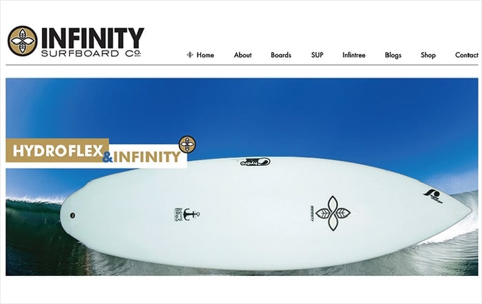
For example, if your company sells surfboards, pictures of some of your top boards on your homepage will draw in the viewer’s attention and help keep him or her focused on the site. If they don't see the products right away, they may be tempted to take their business to a site where they can more easily see what they want to buy.
 Infinity surfboards displays one of its top products on its homepage.
 - Making the contact info difficult to find. If one of your viewers has a question about your business, it is a good idea to make sure that they can easily find the contact info on your ecommerce site.
Even if your site does not have a customer service phone number, it is still important that you provide the details for how they can contact you through email. Otherwise, you run the risk of losing the customer.
For example, say your ecommerce site sells fine jewelry. If your customer has a question about the ring sizes of your product, and he or she can't find a way to ask this question, then this is not good. It could be straight back to google for the customer to find a site which provides a more interactive buying experience.
 Tiffany.com makes it very easy to locate their contact info.
 - Making the images too small. Just as neglecting to add product images to your homepage is a mistake, making the images too small is also a problem. You should think of your homepage as a display case. It is a chance to show off the best products that you have to your customers.
If the images are too small, then your customers may not get to see the details and quality of your products. Let them see! Make the pictures large enough to give your customers a fantastic idea of what they want to buy
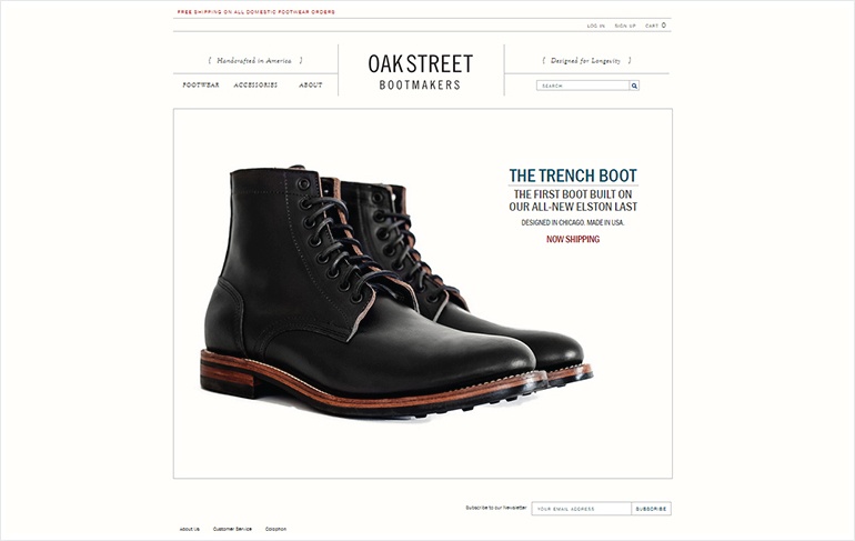
Large product images are also a hot trend right now, and it is good to keep up with the times. Your customers will appreciate your modern, stylish look. This trend has been particularly popularized by Google in their new design concept called material design which involves using classic design principles with large images and bold typography. You can learn more about it here,
 Oakstreetbootmakers.com using large images to display their products.
 - Using convoluted text. The text on your ecommerce site should be clean, eloquent, and get to the point. The goal is to provide the information to the viewers in a friendly and concise way, not to bore them to death, and confuse them with long-winded and complicated sentences.
After all, you are trying to help guide them to buy something, or learn something related to your company, not push them away from your site.
 Apple.com uses very simple, and clean text that does not overwhelm the viewer.
 - Neglecting mobile optimization for your site. Mobile ecommerce is now a dominant force. In fact, mobile now accounts for over fifty percent of the traffic from sites who use Shopify.com’s ecommerce platform.
This means that there is a really good chance that whoever is browsing your ecommerce site is doing so from a mobile device. Therefore, it is important that your site is optimized for mobile. There should be good continuity between the mobile version and the regular desktop version of your eCommerce site.
You may be tempted to drop some features for the mobile version of your site to save cost or time However, you should be very careful making these decisions, because you could potentially irritate customers who expect the same buying experience and features to be available on your eCommerce site irrespective of the device they use.
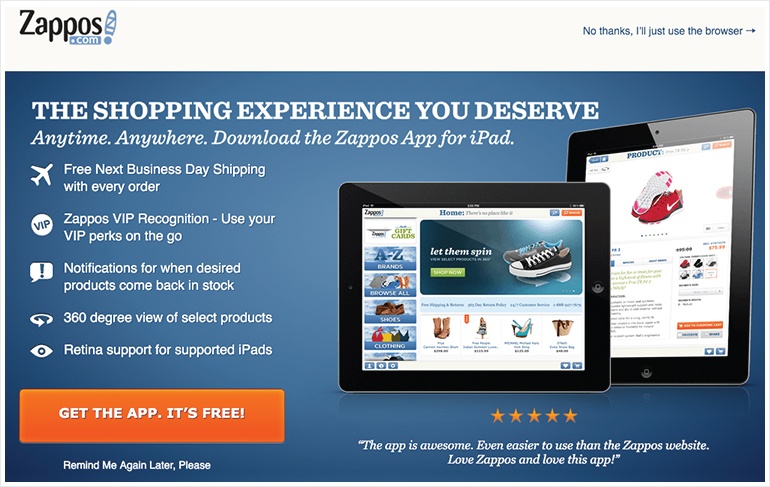
Any glitches should be fixed, and any functionality issues on the mobile version should be resolved at utmost priority. You may just receive a significant chunk of business from people using mobile devices, so why not maximize their shopping experience? The free Zappos.com app lets mobile customers view the website in an optimized way.
 - Not having your site perform well on different browsers. From Firefox to Chrome, to Safari, to Dolphin, there are many different internet browsers that people use. So, it is important to make sure that your site doesn't have major glitches on any of the most popular browsers. If it does, then it is a great idea to try to get your developers to fix it, because it could be costing your business.
-
Not using video content. It is said that a picture is worth a thousand words. Using this logic, it is quite possible that a video is worth a thousand pictures. Using video content in your ecommerce site can add a whole new level of value to your customers.
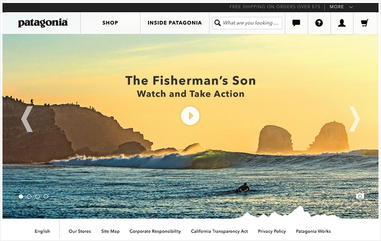
Video can be used to present products, to promote company news and, to answer consumer questions. There is a mountain of potential uses for video. Critically, it can also serve to make the user experience more entertaining. Therefore, it can help generate, quite possibly, more sales. If your competition successfully uses video to demo its products or services, it is time to sit up and take notice. It could cost you business you didn't even know you could have if you don't have video on your site.
 Patagonia.com uses video content to engage viewers and enhance their experience on the site.
 - Overcrowding. It is good to get the attention of your viewers. However, if you have jam packed your website with way too many crazy images and videos, etc. then it can be off-putting to your viewers.
When your visitors come to your website, they should not feel like they are having sensory overload. Instead, they should feel pleasantly interested. So remember not to overdo it!
 The Rolex.com site is very clean and elegant. It demonstrates simplicity and class with no overcrowding


