China
China  India
India  Japan
Japan  Philippines
  Singapore
  South Africa
  Sri Lanka
  Thailand
  Colombia
  Ecuador
  Austria
  Denmark
  Finland
  France
  Germany
  Hungary
  Norway
  Poland
  Portugal
  Romania
  Spain
Spain  Sweden
  Switzerland
  United Kingdom
  UAE
UAE  Canada
  Mexico
  United States
 .svg)

The maintenance worker squinted at the tiny text on the outdated interface, his gloved fingers struggling to hit the right buttons as a critical assembly line alert flashed.
By the time he navigated through five unnecessary screens, precious minutes had been lost—and thousands in production value with them.
Despite the probable impact of bad UX on shopfloor workers' productivity, UX design has yet to be integrated into most OEMs' shopfloor strategies.
Given the economic impact of UX design on productivity numbers, it is a critical strategic element often left unexplored.
In this blog, we'll unpack the crucial UX principles that transform clunky shopfloor applications into intuitive tools that empower workers rather than frustrate them.
We'll demonstrate how intentional design thinking can revolutionize productivity on the factory floor, and provide actionable guidelines that your organization can implement immediately.
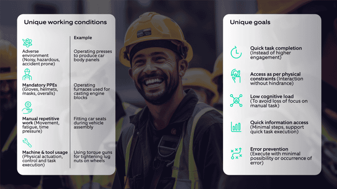
Understanding the shopfloor employees’ context
Shopfloor employees, especially in the automotive industry, work in unique environments and conditions that demand specific skills and training.
Their goals are characteristically different from workers in other industries and functions, requiring detailed analysis to create the right experience.
Building for shopfloor employees – key focus areas
Solutions that don’t actively involve the end users struggle to gain adoption.
Organizations can unlock greater adoption, trust, engagement, and productivity by actively engaging shopfloor employees throughout the process.
Based on our experience of creating multiple solutions for the shopfloor employees for one of India’s largest OEMs, we have identified some focus areas below to ensure meaningful adoption and lasting success.
Designing intuitive dashboards
Dashboards should enable easy navigation from a comprehensive view to specific process information
Effective shop floor dashboards serve a single, crucial purpose: communicating critical information that provides clear, actionable insights.
The type of information, its urgency, and how it is presented vary based on the user’s role—whether it’s machine operation, vehicle assembly, maintenance, quality assurance, supervision, assembly line management, factory management, or plant control—and the specific questions they need to answer.
Through our experience, we identified two distinct types of dashboards catering to these varying needs. Each requires a tailored design approach to ensure relevance and effectiveness:
-min-1.png?width=3081&height=2660&name=2%20(2)-min-1.png)
Figure 2: Different dashboards, their functions and analysis

-min%20(1).png?width=602&height=382&name=3%20(1)-min%20(1).png)
Figure 3: Action and analysis dashboard views
Tailoring dashboards to specific user roles and tasks, whether it’s enabling swift decision-making on the shopfloor or supporting in-depth analysis for strategic planning, avoids a "one-size-fits-all" approach, which often dilutes usability and effectiveness.
Effective data visualization for reduced cognitive load
Replacing raw data with data visualization reduces worker’s cognitive load instead
The human brain processes images 60,000 times faster than text. Studies reveal that individuals use 19% fewer cognitive resources and demonstrate a 4.5% improvement in detail recall when engaging with data visualizations compared to plain text-based information. (Source: https://www.bbc.com/news/business-17682294)
Yet, we have observed that many organizations still rely heavily on raw data formats, such as Excel sheets or lengthy machine logs, that require significant time and effort to interpret. This approach often forces employees to spend more time understanding data than acting on it.
Well-designed data visualizations transform complex data into actionable insights, enabling workers to:
- Grasp key patterns and anomalies quickly
- Identify root causes behind issues
- Implement solutions faster
Figure 4: A four-step approach to creating data visualizations delivers maximum impact
Mimicking physical reality for easy adoption
Digital representation of physical production & assembly lines drives easy adoption (digital twin).
For employees in manual operations, using digital tools can feel overwhelming. To ease adoption, interfaces should be designed to feel natural and intuitive.
By applying the “Match Between System and Real World” heuristic—one of Jakob Nielsen's 10 usability principles—designers can align digital systems with familiar real-world concepts.
Based on our experience creating solutions for shopfloor employees, this approach improves efficiency, usability, and adoption.
Let’s look at the various ways that can bridge the gap between physical and digital ways of working:
 Figure 5: Various ways that can bridge the gap between physical and digital ways of working

Figure 6: A digital line that reflects the physical layout of workstations, along with the operators assigned to each station.
Testing at the place of usage
Evaluate the readiness of the physical environment for the digital solution.
Evaluating shopfloor readiness is about ensuring the environment, people, workflows, and technology can support the introduction of digital interfaces. This evaluation helps identify barriers and opportunities to align the solution with real-world conditions.
.png?width=805&height=1113&name=6-min%20(1).png)
Figure 7: Evaluating readiness for shopfloor implementation
Increase signal-to-noise ratio
Highlight what matters, eliminate distractions for faster decision making.
In shopfloor environments, the Signal-to-Noise Ratio (SNR) directly impacts efficiency.
Signal refers to critical, task-relevant data that users need, while noise includes anything unnecessary that distracts users from finding the information they need to complete their tasks.
It is important to identify noise, which can come in various forms, such as:
- Dashboard crammed with every metric possible, when the operator needs to know if production is on track or falling behind.
- Irrelevant data from other roles or shifts, cluttering the interface with distractions that don’t align with the worker’s task.
- Poor contrast and visual hierarchy, making text hard to read and slowing down quick interpretation, especially in low-light settings.
- Forcing a supervisor to reapply the same dashboard filters daily when the system should remember their preferences.
- Alerts that pop up every five minutes for minor fluctuations training workers to ignore notifications entirely—until they miss a critical one.
- Using too many colors to highlight important parameters. When everything is highlighted, nothing stands out, making it difficult to identify key information.
- User flows that require three screens every shift instead of a quick QR code scan or OTP.
How to make signals more prominent and differentiate them from noise?
Prioritize content with personalized views
- Create role-specific dashboards for the different data needs of operators, supervisors, technicians and more
- Allow users to save filters, layouts, and views to avoid resetting them daily
- Use dynamic filtering to remove irrelevant data, displaying only relevant details automatically
Streamline visual hierarchy
- Position most critical data at the top or center for prominence
- Use font weights, colors, icons, and CTA sizes to guide attention
- Group related data points together with adequate whitespace
Simplify charts
- Limit the number of parameters or colors in visualizations (ideally seven or fewer as per Miller’s Law
- Avoid excessive background colors, grid lines, and labels that create visual noise
Reduce cognitive load
- Highlight only actionable metrics instead of displaying long data list
- Prevent alert fatigue by prioritizing notifications specifically for critical warnings
- Break down complex tasks into steps, revealing information progressively
Declutter
• Remove redundant text, unnecessary borders, and excessive UI elements
• Replace text-heavy instructions with icons, tooltips, or inline hints
Nagarro’s framework for designing shopfloor solutions
Our framework is a result of ongoing engagements with our automotive clients in creating a digital factory of the future using Industry 4.0 principles.
Figure 8: An iterative approach for creating and scaling solutions tailored to automotive shopfloor employees.
How it works?
Understand the current landscape: The shop floor design starts with observing, listening, and asking the right questions.
- Facilitate stakeholders in gathering insights about goals, challenges and product vision.
- Observe users and follow real workflows—not just what's documented or explained, but what happens on the shop floor.
- Identify bottlenecks, workarounds, and pain points.
- Understand workflow dependencies across systems, user roles, and machines.
- Align technology with human behavior, ensuring the interface adapts to workers, not vice versa.
Solve the right problems: A well-defined problem is halfway to the right solution.
- Establish clear problem statements aligning with both business objectives and user needs.
- Define success metrics to measure business outcomes, not just output.
- Leverage a prioritization matrix to focus on high-impact, feasible solutions that drive maximum ROI.
Collaborative Ideation: If workers don’t trust or understand the interface, it becomes a barrier rather than a tool for productivity.
- Engage shopfloor workers in ideation workshops to tap into their firsthand expertise and create solutions that work.
- Avoid designing in isolation, as it can lead you to miss critical usability challenges.
- Create interfaces that feel familiar and intuitive and seamlessly integrate into daily workflows, reducing friction during adoption.
- Leverage the IKEA Effect. When workers help shape a solution, they are more likely to adopt, trust, and advocate for it.
Fail fast, fix early: Catching design flaws early saves time, money, and effort.
- Reduce rework costs by catching usability issues before development.
- Move from low to high-fidelity prototypes, allowing quick and early validation.
- Test in the actual work environment, where distractions, PPE, gloves, fast decision-making etc. affect usability.
- Iterate based on real user behavior, not based on opinions or assumptions.
Optimize and scale: A successful solution evolves, scales, and adapts to changing business needs.
- Implement a smooth rollout strategy and worker onboarding.
- Conduct regular health assessments to track efficiency, adoption, and error rates.
What's next?
We have seen that including design thinking and UX, principles leads to quick user adoption as shopfloor employees invest in solutions they help design, reducing training time and costs.
It further enables error prevention and easy recovery as the design process captures the pitfalls and problem areas during testing, leading to a streamlined workflow.
Ultimately, it increases efficiency and productivity as the information and workflows are optimized for the user’s tasks.
To learn more about our automotive-focused AI-enabled offerings built by keeping the user always in focus, checkout Drive AI.